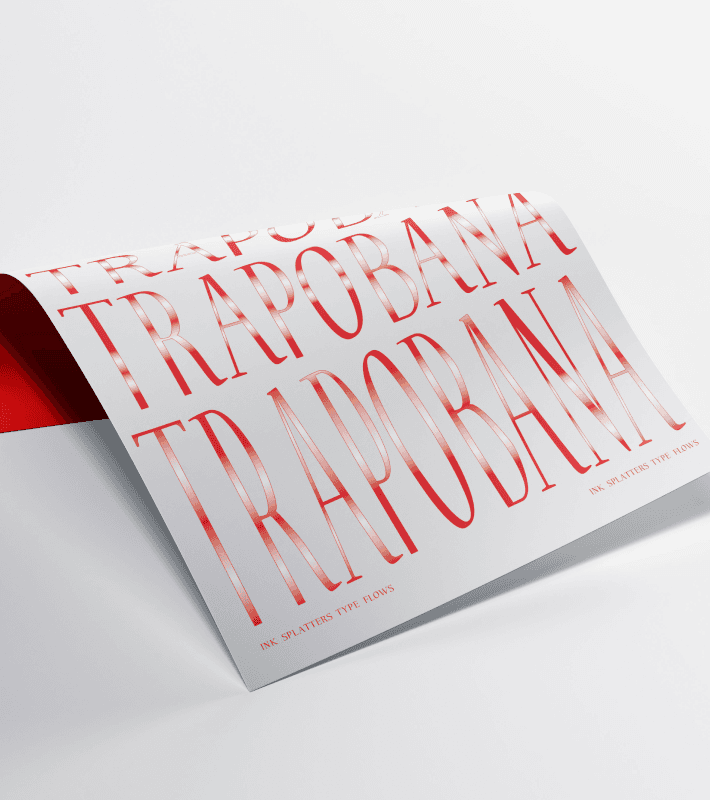
Trapobana typeface
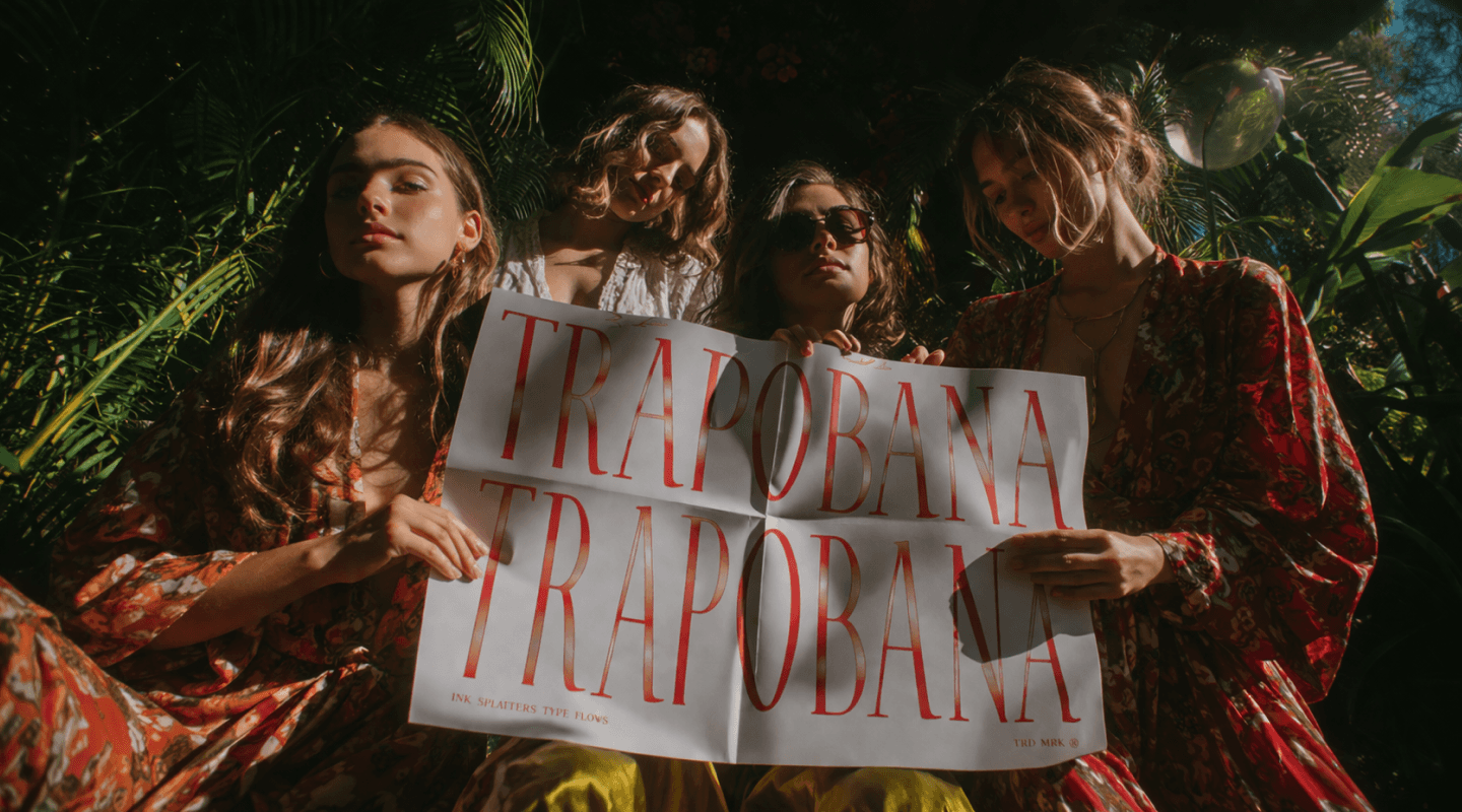
Made for
Trapobana typeface
Location
São Paulo, Brazil
Year
2012
what it is
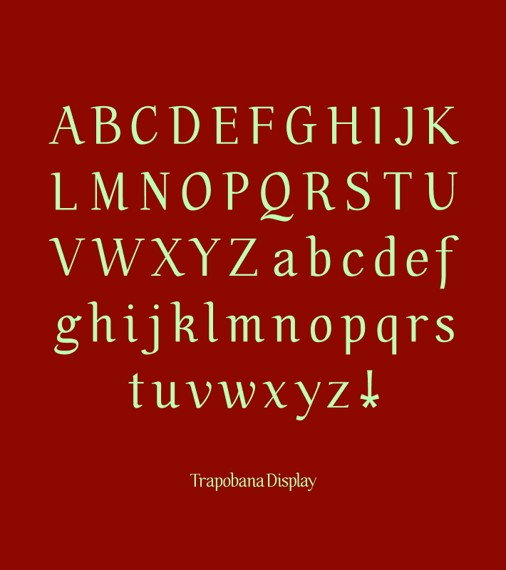
It’s a very deliberate display serif with a calligraphic origin and an editorial attitude. Trapobana Display sits somewhere between a humanist old-style and a stylized transitional display face, but I pushed it toward expressiveness, mood and identity.




FROM HAND, TO SYSTEM, TO EXPRESSION
Trapobana was born from my own handwriting, then pushed into something stranger. I let my natural hand gestures lead me to the general feel and proportions of the typeface, and those features stayed visible in the ascenders, descenders, and serifs of the final forms. From there, I replaced those instincts with a system and created a modular scheme for the placement of head and foot serifs. The stress axis stayed inclined. While I was at it, I extrapolated and distorted the typeface's forms to create a series of expressive typographic compositions. Does it feel unmistakably mine yet?